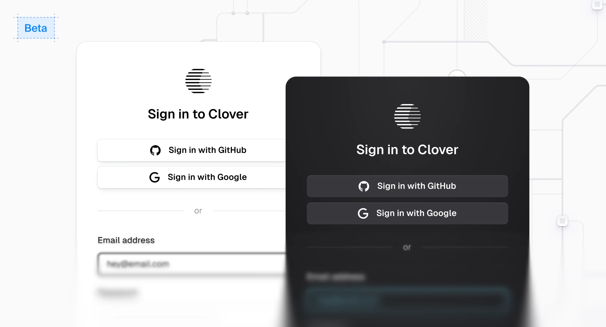
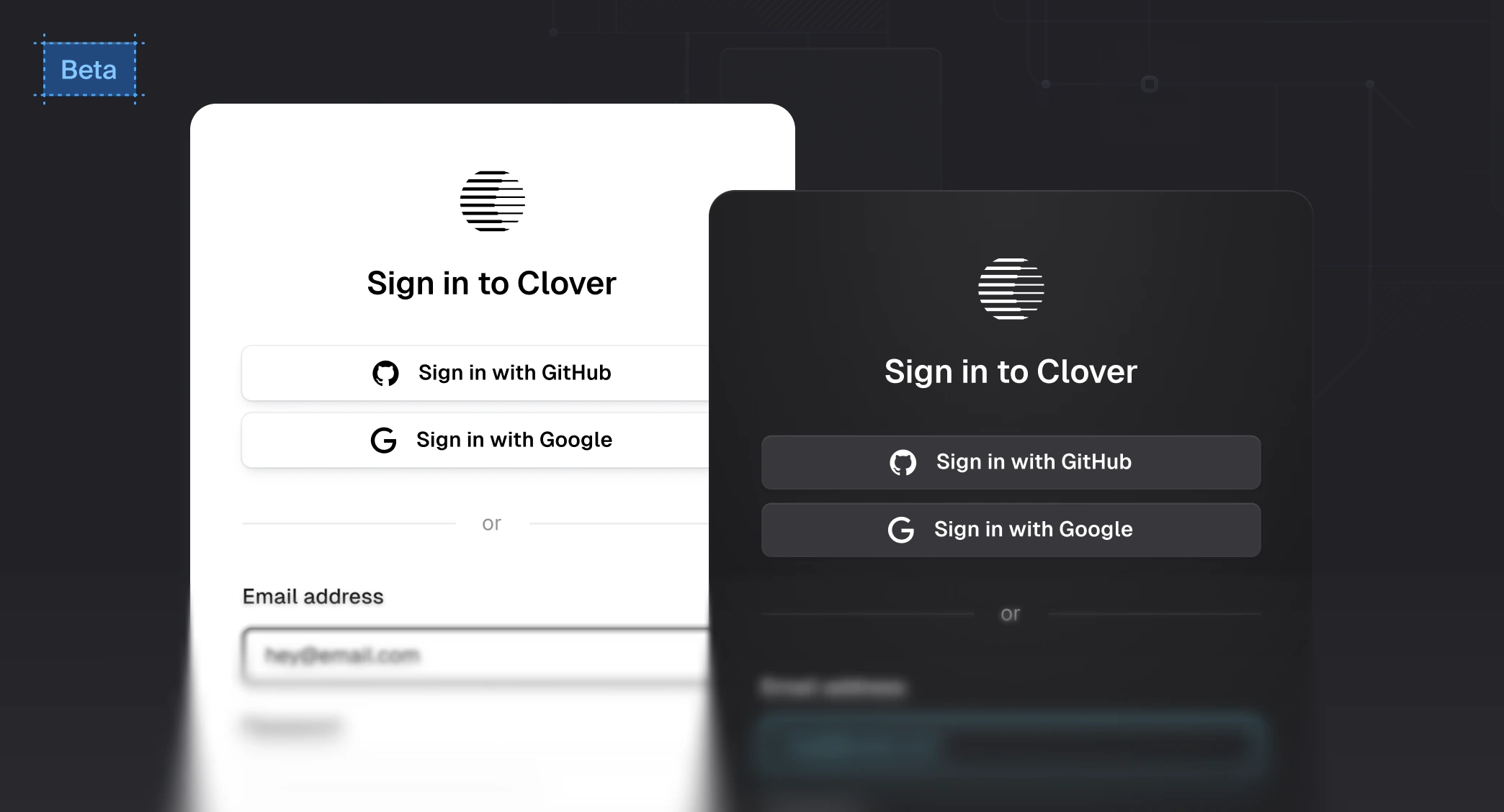
Browser Elements (beta)
Browser Elements is a library of unstyled, composable components that can be used to build custom UIs on top of the Browser APIs without having to manage the underlying logic.
Why use Browser Elements?
You should use Browser Elements if you want a deeper level of control and customization of the styles and layout of your UI while using the Browser APIs. For example, if the appearance prop does not meet your needs, Browser Elements might be for you. That said, you can also use Browser Elements alongside the prebuilt components.
- Component-first - Make it as easy to build custom UIs with Browser as it is with Browser's drop-in prebuilt components. Browser Elements handles the underlying business logic for you and provides a curated library of components without sacrificing on best practices or features.
- Unstyled, with a little bit of magic - Use the web platform and best-in-class components for building great authentication flows. Baked-in to the components are little bits of magic, like the fully accessible segmented input, and instant password validation during sign up.
Integrate Browser Elements into your workflow
Browser Elements can be integrated into your existing application and workflows. For example, you may want to use Browser Elements with:
- Tailwind CSS – If you use Tailwind CSS, you can pass a
classNameprop to most elements that Browser Elements renders. See the styling guide to learn more. - Existing styles or component library – If you have an existing component library that you want to use to build your authentication UIs, Browser Elements supports composition via an
asChildprop. Read the styling guide to learn more. - With prebuilt components - Continue using prebuilt components while customizing the flows you care most about.
Getting started
Browser Elements currently only works with Next.js App Router and Browser Core 2. As it gets closer to a stable release, support for additional frameworks will be added. If your Next.js application is already using Browser, make sure to upgrade to Core 2. If you're starting from scratch, follow the Next.js quickstart before proceeding.
To get started, install the Browser Elements package:
npm install @browser/elementspnpm add @browser/elementsyarn add @browser/elementsbun add @browser/elementsOnce you have your project set up, you can start building custom UIs with Browser Elements using Browser's guides and examples. For example, to use Browser Elements to build a custom sign-in flow, you can explore:
Feedback
Last updated on